
I have been making some website demos for the purpose of people seeing them and becoming willing to pay me to do that sort of thing. You can see them at http://rainbowunicornkitten.com (I just bought the domain because I thought I’d be able to make something for it).
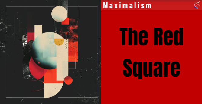
If you take a look at http://rainbowunicornkitten.com#red-square you’ll see a whole lot of animated images flying about, essentially assembling themselves into one image, with some continuous orbiting of parts of the image. This post is about how I did this, since it involves a bit of advanced css using @property and achieving circular motion of background images without using transform: rotate() or moving elements at all, just their background images, of which I am particularly proud!
Why does this matter?
- Background images are how you (should) create decoration in web pages. And not creating html elements purely for decorative purposes is how we’d all like to do it all the time, though it is not always possible.
- If we create new elements for each image and then use
position: absoluteto stack them on top of each other we then have to manage all the elements’ sizes and positions, as well as dealing with the animations themselves. Just using background images in a single element seems clearer and cleaner (and potentially easier). - Once you start moving elements around the page you can quickly run into overflow and scrollbar problems and, on mobile, unwanted space appearing below your content. I really wanted to avoid this, having tried it the positioned way first.
And it should be possible, since we can set multiple background-images on a single element that stack nicely on top of each other, and we can set each image’s position using the background-position property with a list (although AFAICT the background-position-x and background-position-y properties do not take multiple values?)
I started with an image that I carved up into layers using GIMP. All of the images are the same size, not each sized to their content. This makes life a whole lot easier, since my starting point is a well organised set of images each in their final position in the overall effect; I don’t have to shift each image about to get it to where it should be.
BTW this links with a rule that I have derived (which may be how you get taught to do animations, I don’t know). This rule is: before animating anything design your page to be in its final state. I.e. your base or resting state is where you would like things to finally end up, not where you want to start from. You then animate backwards, moving things away from this state to their beginning state at the start of the animation. This means that if nothing animates at least elements are where you would want them to be and it just seems to work better. It’s like pulling back a wrecking ball from next to the wall you want to demolish rather than trying to fire an arrow through a moving gap to hit something behind.
Using @property to animate backgrounds individually
One of the problems of animating background by, for example, animating the background-position property, is that up until recently there has been no way to animate the background position of each image individually. If you put background-position in a keyframe you have to include the background positions of all the images in the background each time, otherwise they would be overridden. This means that if you want to animate multiple background images in the same selector you could only do so using one set of keyframes: hard with two, impossible with the eight images I wanted to separately animate.
What you can and always could do since the arrival of custom properties is use those in place of the individual properties on the background position, so:
background-position: 20px 20px, 50vw 70vh;becomes
background-position: var(--image1-x) var(--image1-y), var(--image2-x) var(--image2-y)and then use those custom properties in an @keyframes animation. However this has very disappointing results:
Basically the values just flip flop between the values specified in the keyframes. There is no interpolation, i.e. no animation.
What can we do about this? The answer is @property . Currently not supported in Firefox, but available in 88% of all browsers according to canisuse.com the @property rule gives the browser the information it needs to be able to actually animate, or interpolate, custom variable values. It looks like this:
        @property --image2-x {
            syntax: "<length-percentage>";
            inherits: false;
            initial-value: 0%;
        }
Simply by adding these declarations into our css, browsers (except Firefox) are able to work out what the intermediate values should be and we get animation.
Noice!
So now I can have an element with multiple background images with just one background-position declaration but each with their positions individually animated using their own keyframe. In fact I can separately animate each axis of each image’s position, which is about to be important. The Power!
Circular animation of background images
What I really wanted to do though was have some of the image animations in my background run forever in a circular motion, while others just ran once. What we did above using custom properties means we can easily have different animations, each with their own iteration count and timing function, affecting different elements of the background-position.
But how do we get circular animation? Surely it is possible isn’t it? If you’re animating elements, rather than backgrounds, you can use the transform: rotate() function to achieve circular animation: see this Stack Overflow answer which is awesome and cool, but no good to us since we can’t rotate background images separate from their containing elements.
I fell into a reverie. I even lay down on my bed. My mind filled with graphs of circles and x & y axes. I even gingerly approached a dilapidated and hazardously decrepit hut in my mind labeled “Mathematics”. Did I dare to enter? What horrors lay within? Could I, in fact, craft a background-position declaration that used calc() to generate x & y coordinates for a circle from linearly varying custom properties? I shivered.
Luckily I never had to find out. It was that “linearly varying” phrase from the last statement that eventually led to an answer that involves no even remotely non trivial arithmetic.

The above is a diagram of my brain, or at least what was in it. I was trying to think how to calculate this myself. I realised that when the x axis was changing fast, the y axis was changing slowly and vice versa. And then something else dawned on me: isn’t the rate of change of values what the timing functions control in animations? So I started to think that I could animate the x and y and that timing functions might help make it circular.
This was something like my first attempt. As you can see, there is some sort of repeating animation that goes around 4 points “circularly” but it definitely isn’t a circular animation. It is a diamond shape: 4 diagonal animations together.
First what it needed was to be 2 distinct animations (nearly there, I promise). But this isn’t it either
Then I knew that I just needed to vary x and y along a straight line with easing applied so that when x was moving fast, y was slow and vice versa. I changed easing functions and messed with stuff, but it didn’t help. And then this technique came back to me: Starting animations mid way. And this is what I needed, as a way to run 2 animation together, but out of step with each other.
Lo and behold, circular animation! Believe me, I was very surprised that it had worked. In my experience life is made up of a lot of “great” ideas that don’t in the end work out. This is an exception.
The code
<!DOCTYPE html>
<html lang="en">
<head>
    <meta charset="UTF-8">
    <title>anim</title>
<style>
html,
body,
div {
  width: 100%;
  height: 100%;
}

div {
  background-image: radial-gradient(
      circle at center,
      blue 5svw,
      transparent 5svw
    ),
    radial-gradient(circle at center, yellow 20svw, transparent 20svw);
  background-color: black;
  --image2-x: 0vw;
  --image2-y: 0vh;
  background-position: var(--image1-x) var(--image1-y),
    var(--image2-x) var(--image2-y);
  animation-name: orbit-x, orbit-y;
  animation-duration: 2s;
  animation-delay: 0s, 1s;
  animation-iteration-count: infinite;
  animation-direction: alternate;
  animation-timing-function: ease-in-out;
}
@property --image1-x {
  syntax: "<length-percentage>";
  inherits: false;
  initial-value: 0%;
}

@property --image1-y {
  syntax: "<length-percentage>";
  inherits: false;
  initial-value: 0;
}

@property --image2-x {
  syntax: "<length-percentage>";
  inherits: false;
  initial-value: 0%;
}

@property --image2-y {
  syntax: "<length-percentage>";
  inherits: false;
  initial-value: 0;
}

@keyframes orbit-x {
  0% {
    --image1-x: -20vw;
  }
  100% {
    --image1-x: 20vw;
  }
}

@keyframes orbit-y {
  0% {
    --image1-y: -20vh;
  }
  100% {
    --image1-y: 20vh;
  }
}
</style>
</head>
<body>
<div></div>
</body>
</html>
Conclusion
So that’s how I used @property to animate multiple background images on the same selector in pure css and then to create circular animations for background images. I used the background-position property to animate backgrounds and exploited the ease-in-out timing function to make animation follow a circular path, an alternative to using transform: rotate() for any circular animation in css.
And this is the thing I eventually made using this technique: https://rainbowunicornkitten.com/#red-square
I hope this has been an enjoyable and useful read. If you want someone to do something like this for your website, please get in touch!
References:
Disney’s 12 principles of animation, exemplified in UX design
How to do circular animations using transform: rotate()


 New Work